Nashville Predators Concept Jersey /
We are huge hockey fans here at Rockhopper, and our favorite team is the Nashville Predators (nope, not the Pittsburgh Penguins). So when the NHL switched to Adidas as their jersey providers a few years ago, a lot of fans wondered what their team’s new jerseys would look like. As a Preds fan, our fanbase was hoping for the introduction of a navy blue alternate jersey. We knew the team would be sticking with their famous gold sweaters, but that didn’t stop us from creating a concept jersey for a navy blue alternate jersey that’s clean and simple.
At the time we made this concept, the Predators’ primary jersey was gold with a lot of elements going on (see here). Our idea was to simplify the design but still incorporate a few elements to keep it unique to the Preds.
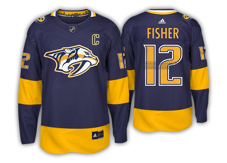
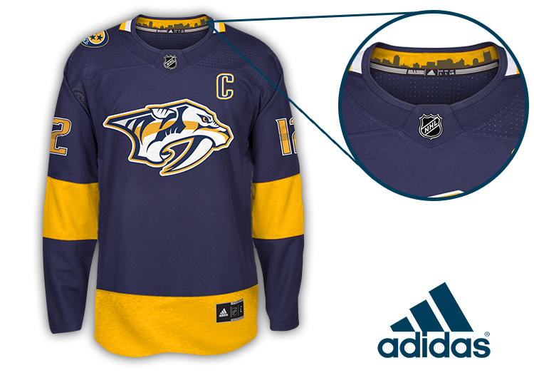
We made the jersey navy, kept the unique font of the numbers (six lines through the numbers represent guitar strings), and simplified the sleeves to a more classic look. Adidas is also known for adding text and graphics to the inside collar of their sport jerseys (both NHL and MLS). To keep with that trend, we added the iconic Nashville skyline into the collar.
We did this concept a few years ago, but it’s still one of our favorites. Every hockey season, teams announce they’ll be getting new jerseys. Without fail, Preds fans always are asking for a navy jersey, so we send this out and it’s always a huge hit. Right now, we miss hockey (and sports in general) so it felt right to blog this concept again.
Go Preds!
- Rockhopper /